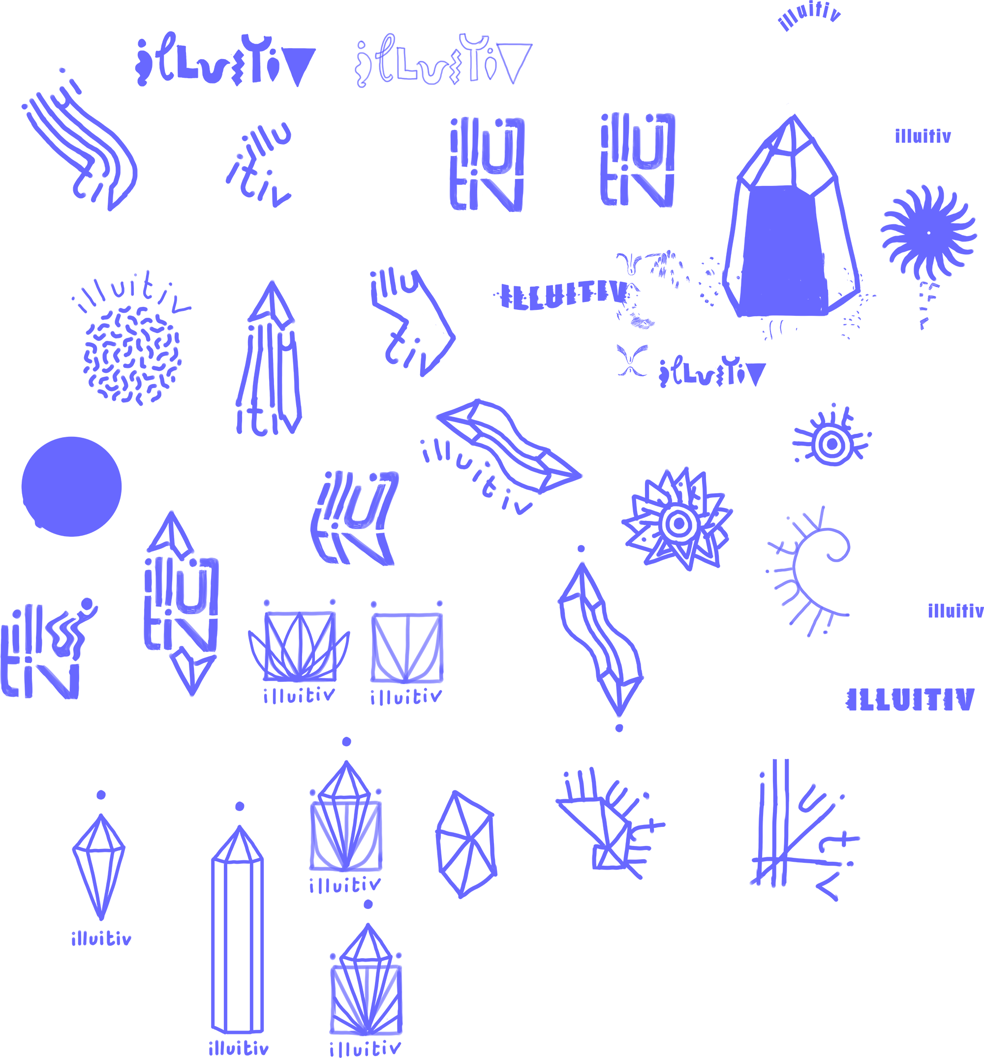
illuitiv logo
The name illuitiv blends illustration and intuition — the two forces that sparked this project. The logo, in contrast to the flowing, detailed drawings, is clean and geometric.
It layers all the letters of Illuitiv into a sharp, almost stained-glass-like composition — with straight lines, angles, and curves held in balance. A crystal shape crowns the design, and the three dots refer to the Holy Trinity, but also — simply — to the three dots on the i.
To match the visual language of the logo, I chose the typeface Run — a font with equal line weights and a calm, geometric rhythm. I was specifically looking for a U with a semi-circular curve that echoed the forms in the logo. This way, the wordmark and the symbol feel like they truly belong together: one quiet, deliberate whole.
