Praktijk Jeroen Koch
Podiatry & Reflexology
For the visual identity of Practice Jeroen Koch, podiatrist and reflexologist in Eindhoven, I developed a logo and complete visual style that reflects both the medical professionalism of his work and his holistic view on health and wellbeing.
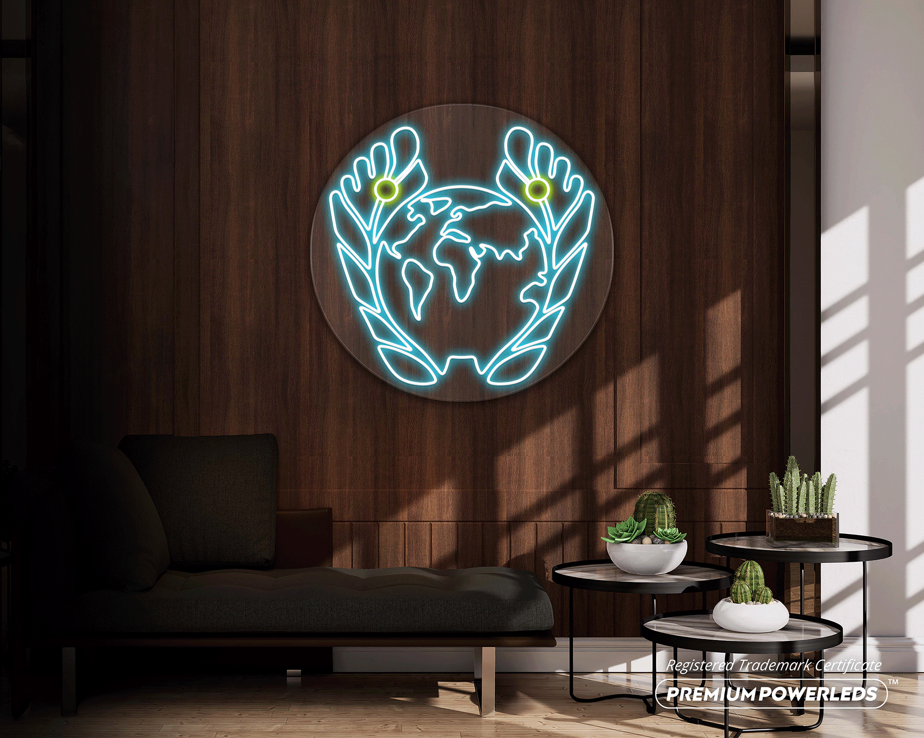
Feet are central to Jeroen’s practice, not only in a physical sense, but also as gateways to the body’s energy flow. This idea became the foundation of the logo: subtle lines represent the energy pathways in the feet, while the pressure points between the big toes refer to reflexology and balance. His holistic mindset, caring deeply for people, the earth and a more connected world, is symbolised by the globe integrated into the mark.
The colour palette consists of fresh, optimistic tones that fit naturally within the healthcare sector, while still conveying trust, expertise and clarity. Medical credibility was an essential aspect of the design, without losing warmth or humanity.
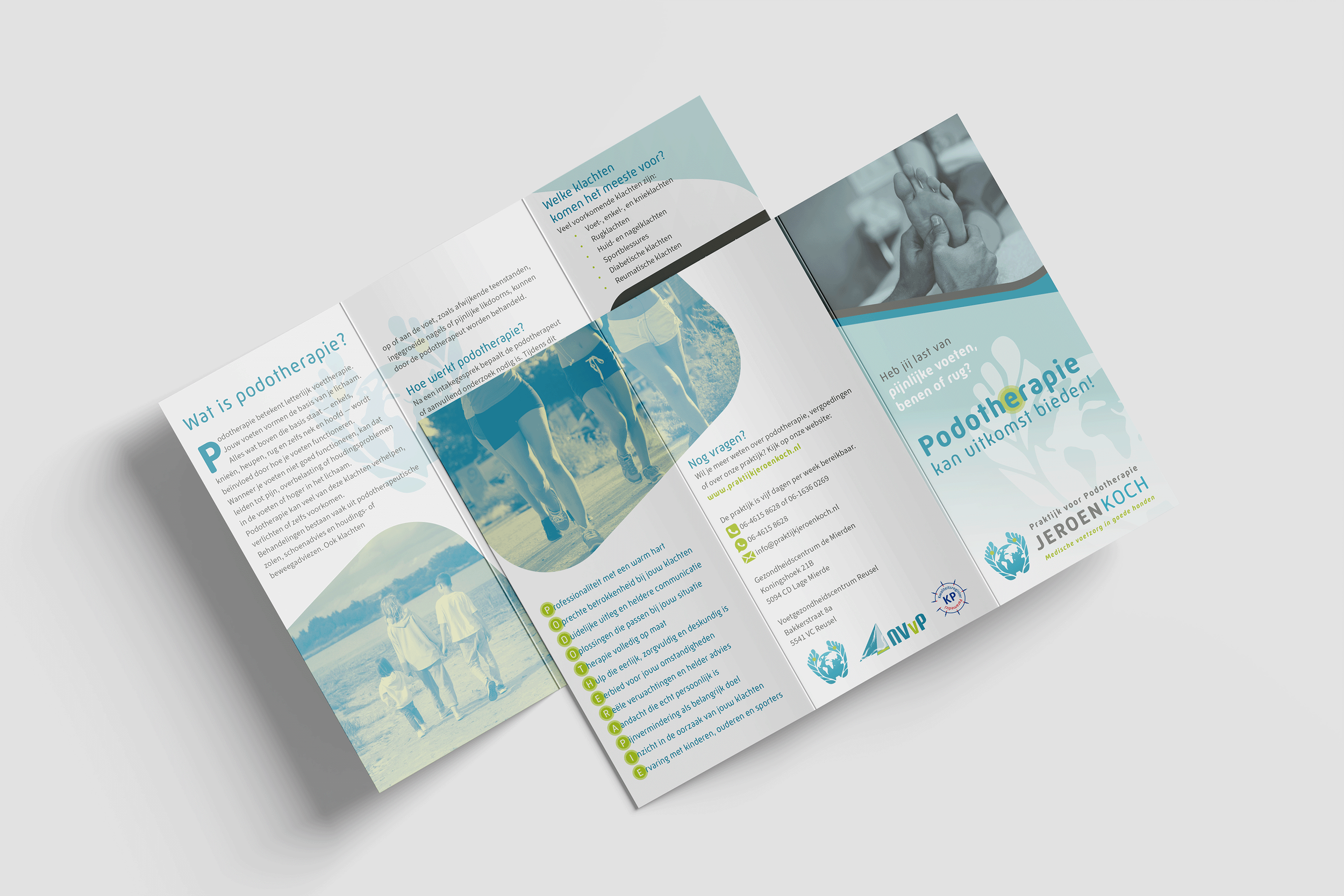
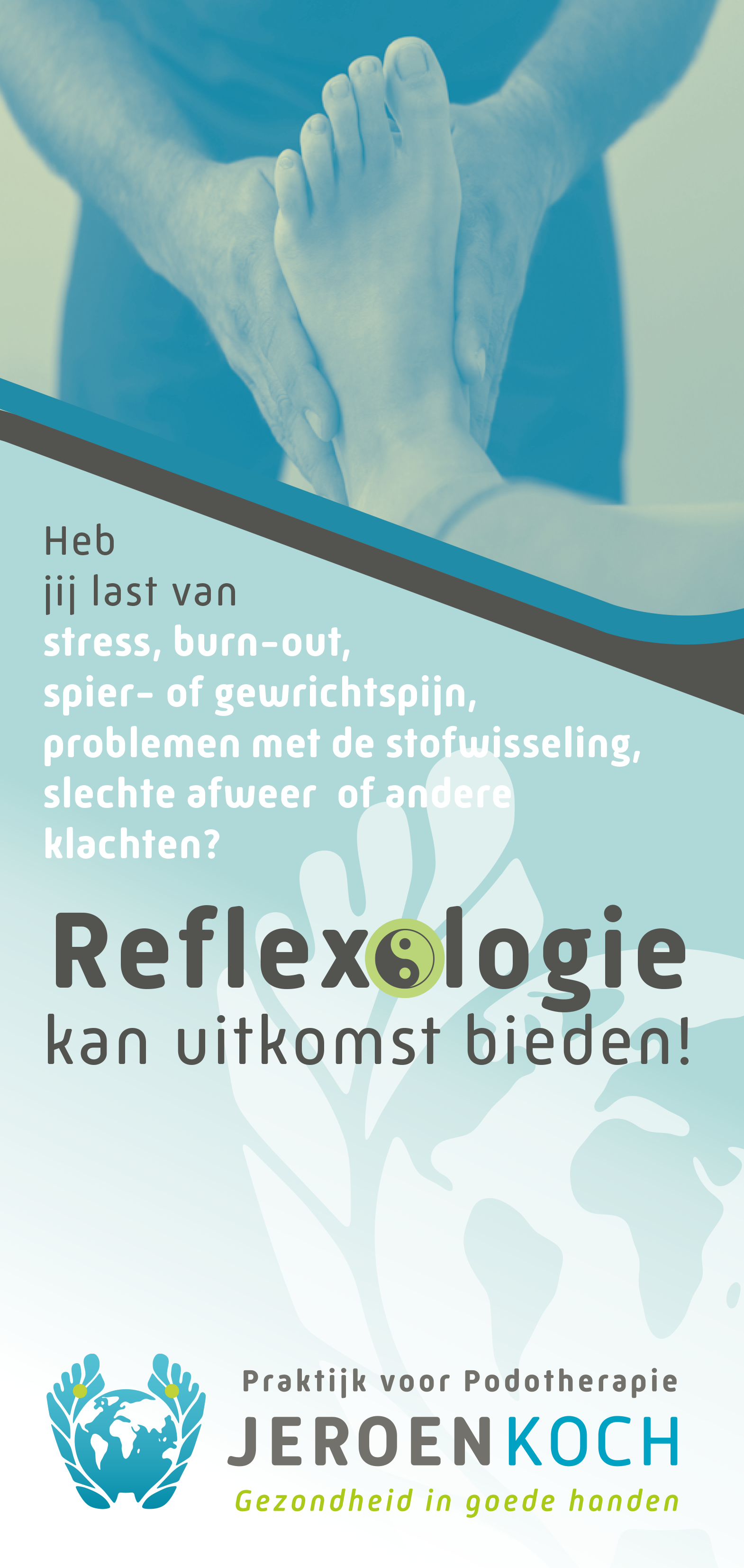
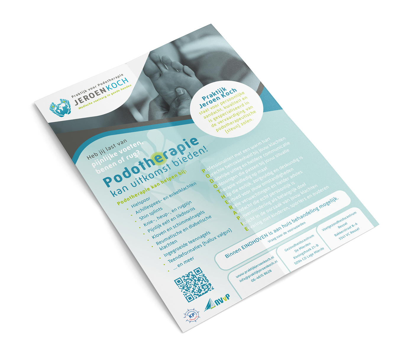
In addition to the logo, I designed the typography and the layout for various physical communication materials, including brochures and flyers, resulting in a coherent and thoughtful visual identity..